GTech Designs
Brand / Print / Web
Objective
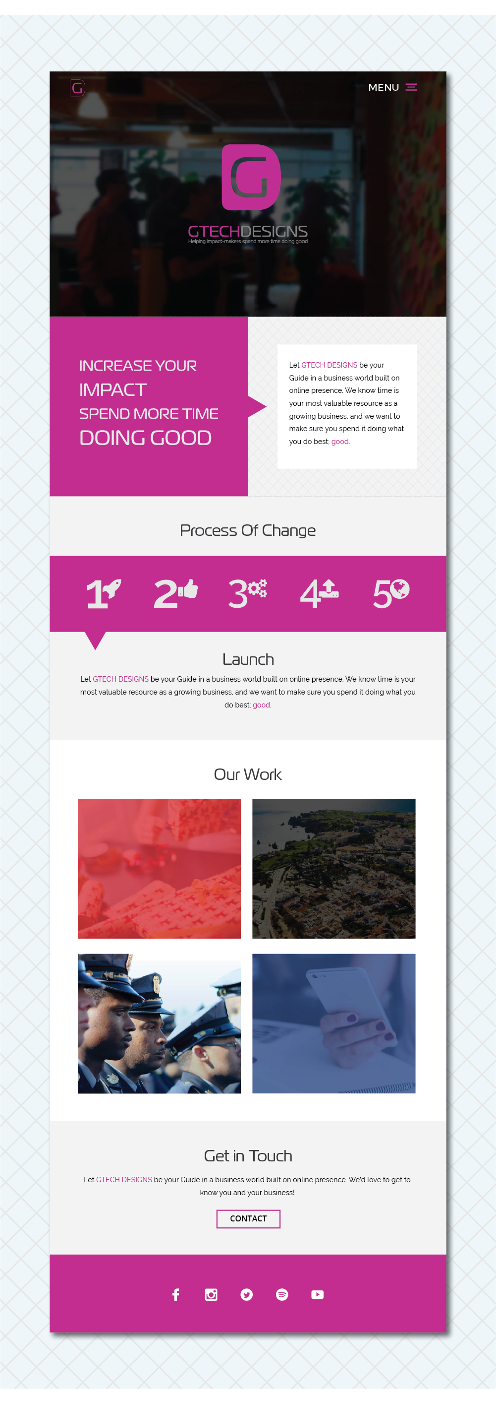
My primary objective during my internship at GTech Designs was to spearhead a visual re-branding, creating a uniform image across web and print. This re-branding would facilitate the launch of a marketing portfolio targeted toward potential clients looking to re-brand their own materials. The resulting collateral would include new print materials as well as a redesigned landing page.
Process
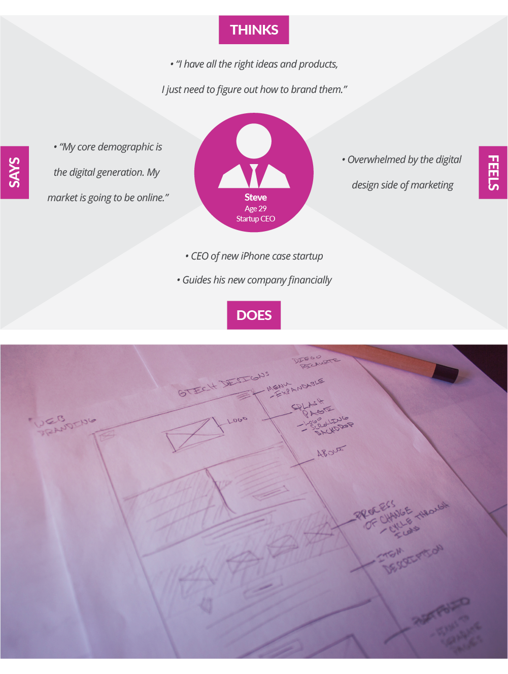
The design process began with low fidelity wireframes of the digital and print materials. I also developed a user persona that illustrated the primary clientele of Gtech, and in turn the audience of the new collateral. The brand identity needed to seamlessly transition between print and web, creating a uniform experience for the user regardless of the entry point. With that in mind, I organized the information in a grid style that would translate well to print as well as digital format.
Solution
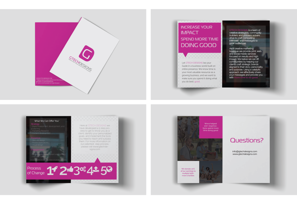
The resulting print and web design allows for a clear and clean user journey throughout the new collateral. My re-branding image expands on the purple logo of GTech Designs, using the same hue to accent the website's focal points. The print pamphlet guides the user through an introduction of Gtech's brand and mission, followed by their design approach and how potential clients can get in contact with the GTech team. The website follows a similar hierarchy, and expands on the pamphlet materials by providing examples of GTech's past successful projects. Together, the site and print materials serve as an example for what GTech can accomplish for its clients; a clean, modern, and story driven design style that looks professional and personable.

Reflection
This project allowed me to first explore digital design, and develop my sense of creating a uniform branding image. Not only was I forced to design to a completely new medium for the first times, but I also had to figure out how to create a uniform visual identity utilizing both digital and print mediums simultaneously.

