Johns Hopkins- Radar
Brand / Digital / UX / UI

About
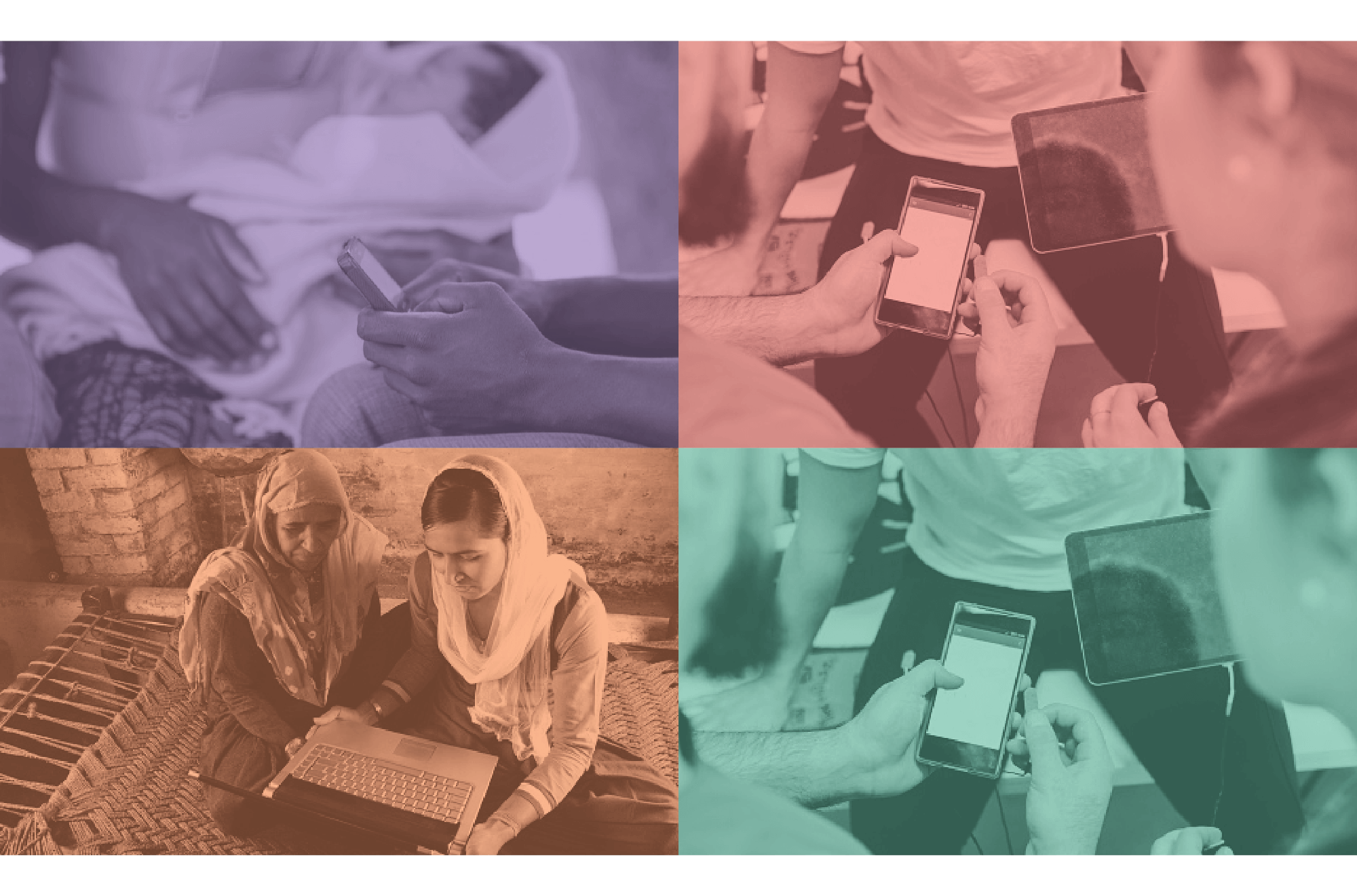
Under Johns Hopkins University’s Computer Assisted Personal Interview (CAPI) Initiative, the RADAR program allows public health professionals to gather and measure information about maternal, neonatal, and child health using electronic devices in the field.

Objective
My primary objective was to design a homepage for RADAR that would serve as a starting point for all of its functions. The site would need to cater to various anticipated users, ranging from trained medical professionals to graduate students who are unfamiliar with the program and its associated technology. In addition to meeting these basic criteria, I was expected to adhere to design preferences specified by the JHU RADAR Team.

User Research
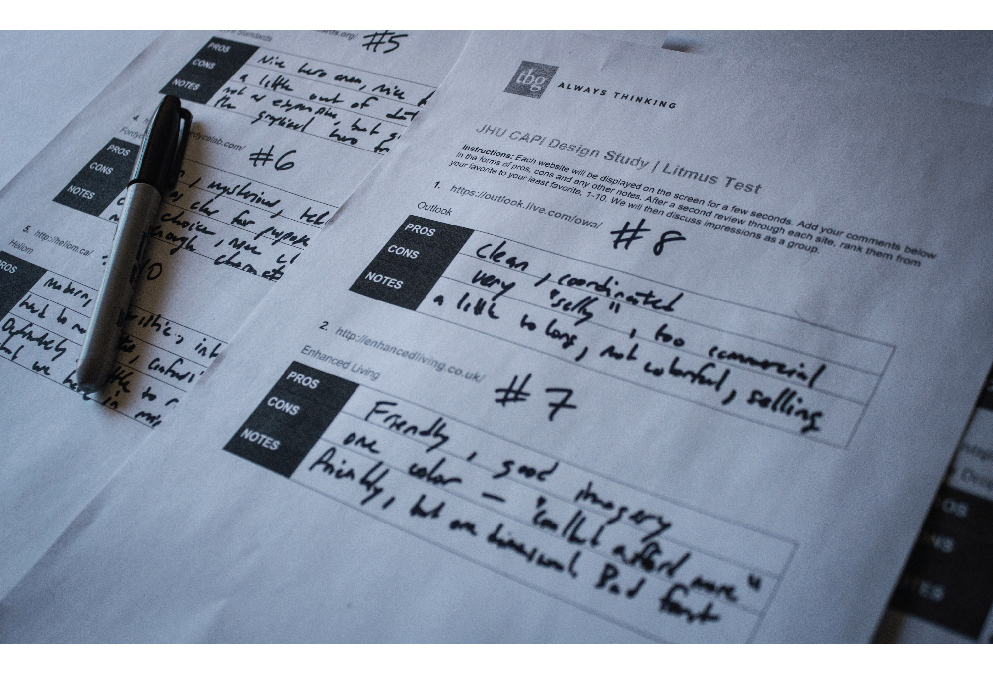
The initial stages of the creative process utilized a co-design lab with the JHU RADAR team. This enabled me to better understand the team’s design preferences as well as their specific design goals. To this end, I initially compiled samples from a variety of websites that employed different types of imagery, fonts, color palettes, and interactive elements. I presented these sites to the client and asked them to individually complete a worksheet that ranked the websites from 1-10 overall. In addition, the team was asked to note their favorite and least favorite elements of each site. From this exercise I learned that the JHU CAPI team wanted me to design a website that was user friendly, personable, colorful, simple to navigate, and distinct from the overarching Johns Hopkins brand.

Design Process
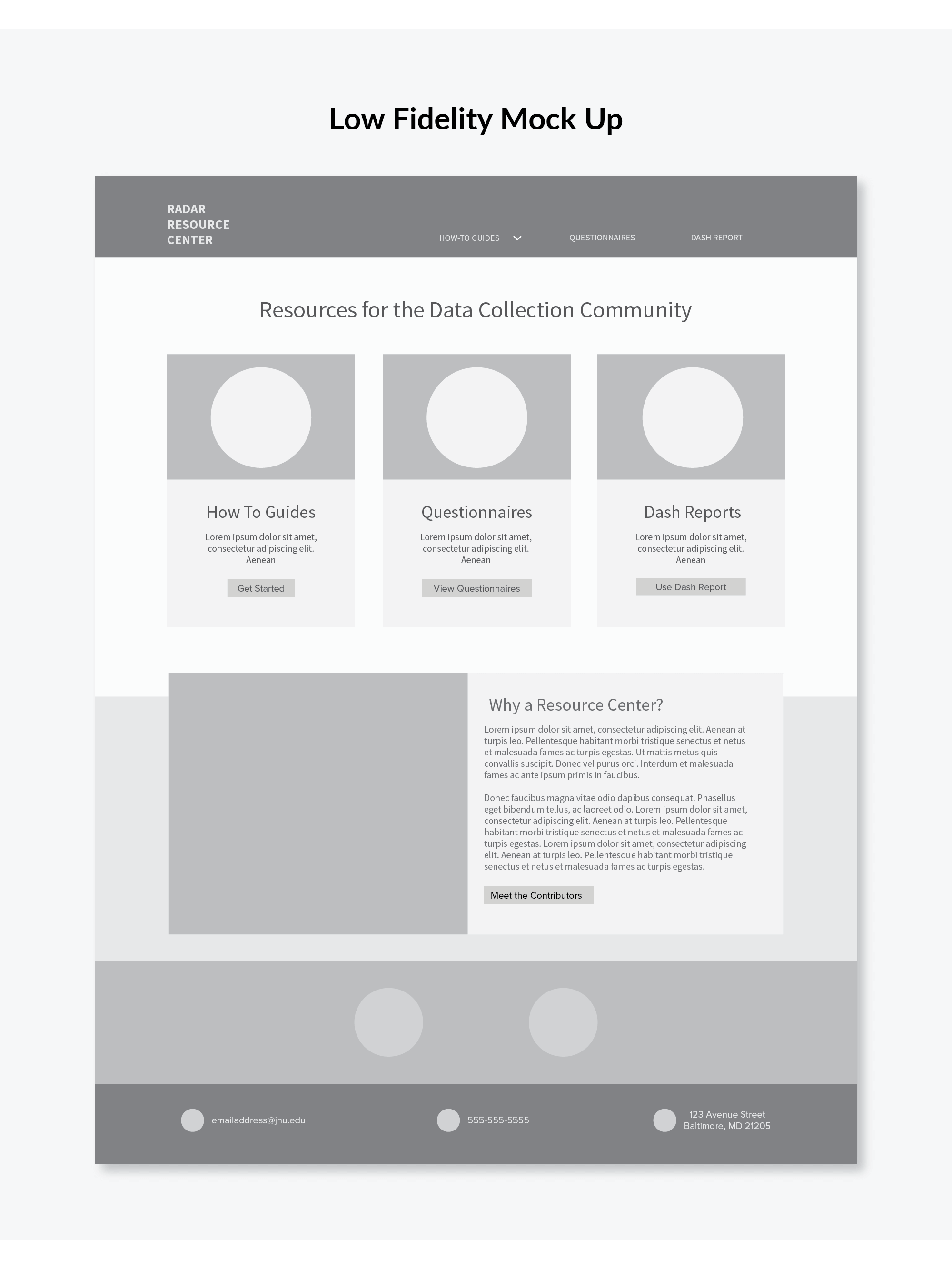
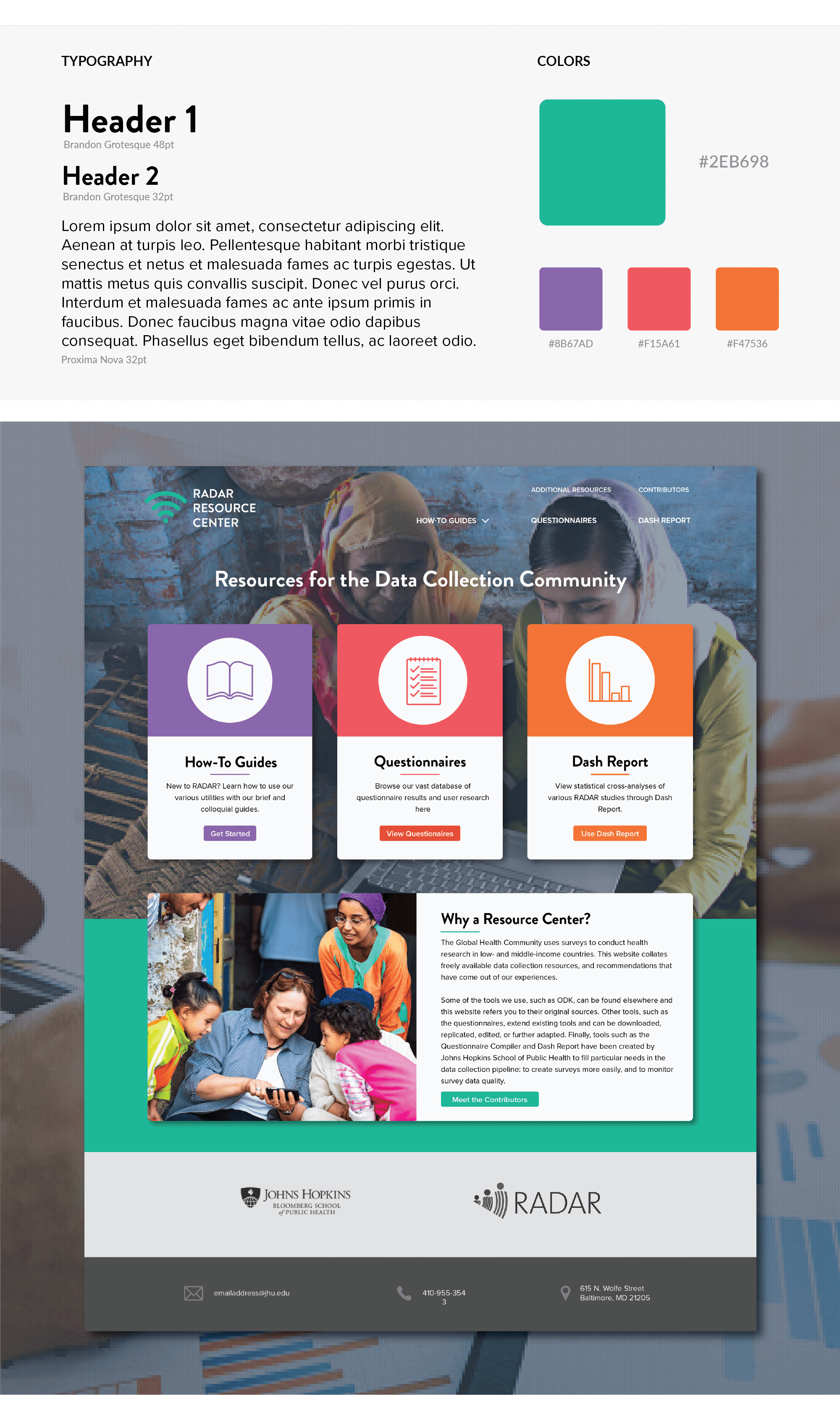
Based on the results from the co-design lab project, I knew that the new RADAR website should be clean and simple as well as prioritize functionality over form. For these reasons, I designed the homepage structure without the traditional, photo dominant “hero image” structure, but instead featured a hero area that drew attention to the three main functionalities of the program (How-to Guides, Questionnaires, and Dash Report). Following the hero area would be a brief and colloquial “About” section, that would explain the purpose of the RADAR program as well as a section where the user could learn more about the researchers contributing information to the program.

Final Mock Ups
The ultimate website design incorporates all the information from the co-design lab, in a simple yet lively design. It utilizes a shade of teal as the central accent color in order to relate to the JHU blue while still establishing a unique brand. The hero highlights the three core functions of the site, with the lower section offering the user additional content, if needed. The additional accent colors and immersive hero image make for a friendly and varietal user experience, which is a welcome change from most data collection software websites.


Reflection
The abundance of user research made for a relatively frictionless design process, but it was not without its snags. Choosing the correct image for the hero area created a stall, as there was debate as to whether the environment related to the program should be more “outdoors and environmental”, as opposed to “indoors and tech-centric”. My initial direction was more technologically based, but the client ultimately decided that it preferred a design that felt more humanitarian. As a result of this experience, I have developed a new questionnaire for future projects that will utilize a co-design lab. The goal of this questionnaire is to better determine the types of images preferred by the client.


