About
During my time at Cornell, I performed as a member of a co-ed a cappella group, The Key Elements. During my freshman year, I took on the task of redesigning the brand image of the group. After graduating from Cornell and gaining more experience in branding and design, I decided to revamp my own designs, and once again update the groups’ brand image.
Objective
My primary objective in working with The Key Elements a cappella group was to facilitate a branding overhaul that would appeal to a greater proportion of the Cornell student population. To accomplish this goal, I decided to conceptualize, design, and code a new website for the group. This re-vamped media was intended to re-introduce the group to the Cornell population using a renewed and updated image, in order to maximize audition and concert attendance.

User Research
I began the design process by interviewing 23 individuals familiar with the group and who had attended Key Elements concerts. Using the information gathered from these interviews, I created three distinct user personae. Based upon differences among the three personae, I concluded that the website would need to have a wide appeal and utilize a brand that is attractive to a variety of viewers, regardless of music preference, age, or gender. The new website needed to be desktop and mobile friendly, and should provide easy access to the group’s music, events, personality, merchandise, and contact information. Further, renewed visual identity needed to set the Key Elements apart from any of the other 20+ singing groups on campus.

Design Process
I began the design process by interviewing 23 individuals familiar with the group and who had attended Key Elements concerts. Using the information gathered from these interviews, I created three distinct user personae. Based upon differences among the three personae, I concluded that the website would need to have a wide appeal and utilize a brand that is attractive to a variety of viewers, regardless of music preference, age, or gender. The new website needed to be desktop and mobile friendly, and should provide easy access to the group’s music, events, personality, merchandise, and contact information. Further, renewed visual identity needed to set the Key Elements apart from any of the other 20+ singing groups on campus.

Final Mock Ups
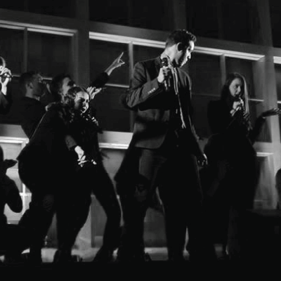
The newly designed logo retains the core 'bolt' motif of the previous Key Elements branding. A new “musical” component has been added (a microphone), in an effort to stay true to the core features of the group. The new, customized site features a simple scroll-through structure, where users can navigate to obtain group member information, as well as sample music, and Key Element merchandise. Widgets and links throughout the site guide the user to various social media and music platforms utilized by the group, allowing for easy access to various promotional content. The site prioritizes event information near the top of the page, so that any concert-goers or potential auditioners can find the information they need in a timely fashion. The overall website is color neutral and people-focused, allowing the personality of the group to shine through, and creating a genuine user experience of what it is like to attend a Key Elements a cappella concert.


Reflection
Although the combination user research and communication with group members made for a relatively smooth website creation, I did hit a snag toward the end of the project. In particular, I discovered that the president of the group (who was my point of contact) had not informed group members that there had been a logo change. After launching the new brand image, one of the group members objected to the new logo. This member was an activist in the “Black Lives Matter” movement and thought that the new logo too closely resembled the logo of that organization. To resolve this issue, I presented a variety of other logo options to the group as a whole and allowed them to vote on a new one.
Overall, I learned that is an important skill to remain impartial and emotionally unattached to my design choices. This permits design flexibility and a willingness to pivot in different directions. This challenge led me to realize that no matter the emotional connection to any particular design choice, the satisfaction of the user remains paramount